Overview
Every design created in Tenon includes at least one row. Rows are the primary structural element for any email or page you create in Tenon. Any content block that you drag and drop onto the builder stage is placed into a row.
Rows allow your design to be mobile responsive. They adjust their width automatically to fit the screen of the device that the design is viewed on. In other words, there are no hard-coded values applying to row size. You can see this behavior with both the builder stage and export output.
Row Properties
By selecting an entire row, you can apply design elements to several content blocks at the same time. Here's how you can select and work with rows:
1. Hover your mouse over an empty area on the stage, either to the left or right of the content area width.
2. Click outside of the content area to select the entire row.
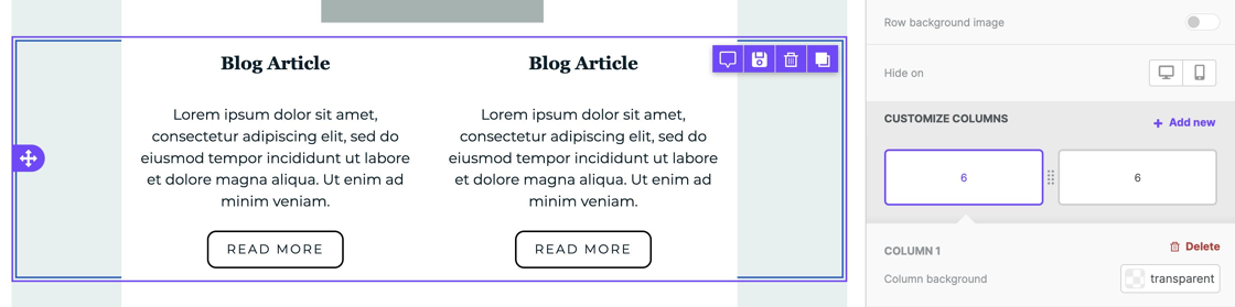
Once selected, the builder sidebar will reflect several row properties. You can use these options to apply design elements to the entire row. These options are broken up into sections to help you better identify them.
Backgrounds
The Backgrounds Row Properties provide you with the following customization options:
- Row background color
- Content area background color
- Row Background Image
Borders
The Borders Row Properties provide you with the following customization options:
- Content area border
- Content area rounded corners
Layout
The Layout Row Properties provide you with the following customization options:
Dynamic Content
The Dynamic Content Row Properties provide you with the following customization options:
- Display conditions
Cards Style
The Cards Style Row Properties provide you with the following customization options:
Columns Structure
The Column Structure Row Properties provide you with the following customization options:
- Column background
- Column padding
- Column border

Each column within a row has its own Columns Structure option.
You can learn more about using columns in Column management.